Graphic Design
Blog
|
Expressing yourself in one word is a difficult thing to do. I believe what makes you you is what you've gone through and experienced up until this point in your life. Drawing the events that has led to you having the personality you have now is also difficult to pinpoint. For many years I always told myself to just be average because being something different wouldn't be realistic for me. I didn't expect much out of myself and thought only certain people were meant for great things. I still have this idea to a much smaller extent today but I'm not afraid to take risks and trying to be different. If I had to describe or represent myself in someway, the closest would be the zodiac sign Gemini. I like to say that my personality is split into two halves, one half a realist, the other half an idealist, one half making decisions based off impulse, the other off of reason, Though these different personality traits can often collide and contradict each other when I try to make important decisions, I think it makes me unique and gives me a sense of individuality. 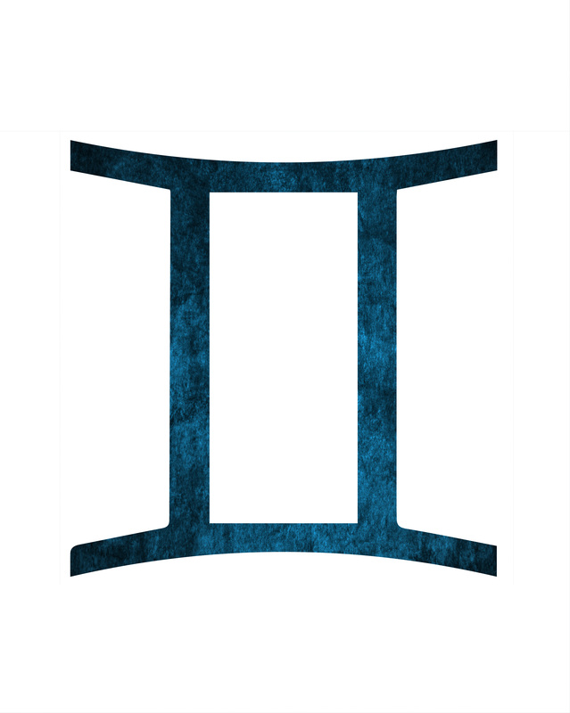 Making an artwork strictly off of whatever resources I found on my phone was a lot harder than I imagined. When presented with this project, my immediate thought was to use the drawing filter on Snapchat and illustrate something, but after several attempts, I realized it was much too difficult due to the small screen on my iPhone and the precision I would have to use my finger to draw. I eventually turned to an app I downloaded called Photo Editor+, which became the main app I focused on for the production of this project. The first difficulty I had was choosing an actual photo to edit, I didn't want something that already had a lot of content on it, rather something that would give me a lot of freedom to manipulate with. This brought me to look back at previous hand lettering projects which gave me the idea to take a photo of a blank page from my sketchbook. I made another hand lettering piece but this time through my phone which I thought was pretty cool. The editor app allowed me to create text and choose a font along with it. I used the lyrics to a song called "Hey There Delilah" by the Plain White T's and formatted it how I would if I was actually hand lettering it. Blurring the line "close your eyes" was a risk that could either make or break the entire look of the quote, But I liked how it turned out. I then used a sticker of an arm pointing to the left, referring to the line "I'm by your side". Finally, I finished the piece off with a fade of the edging and a sharpness filter to make the image have a refined and artsy look. While writing this post, I've realized that the spacing between each line is a bit awkward and looking back would like to pay more attention on the distance between them due to the importance of negative space.
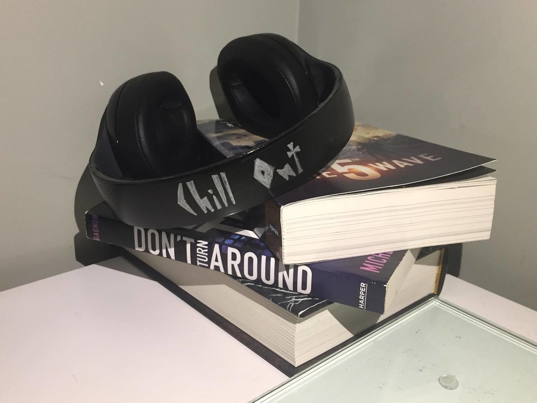 For this blog assignment I spray painted an old pair of headphones that stopped working a while back. For the phrase I decided to choose something that related to listening to music. You tend to "chill out" when you put on headphones and start to listen to music, making me decide on it as my final phrase. Since the idea of my objet was to relax, I placed it in an environment that would resemble relaxation, resulting in the stack of books. Whenever I feel like just relaxing, I would end up just plugging in headphones and listen to music, which is why I chose an old pair of broken headphones that I've had for a few years. I adjusted my lamp to try and give it the perfect lighting but still didn't receive what I had hoped for due to the lack of areas in my house that would result in good lighting.
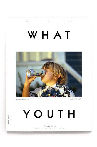
 Generally, every magazine likes to exaggerate the content that it provides at an attempt to catch the reader's eye. For this image I asked my friend to wear something a skateboarder would probably wear and to do something casual with the skateboard. The image of him sitting on the skateboard with takeout in one hand and a drink in the other rather than actually skateboarding is meant to contradict the quote, "its easy to lose focus...don't," creating an ironic concept on the cover. To have the same exaggeration as the common magazine, I decided to put in the phrases "LUPTON'S JOURNEY TO THE TOP" and "THE NEXT TONY HAWK" to follow that exaggeration theme. The ESPN magazine logo is almost always on the top of the cover, I chose colours for the phrases and logo to expose each other and go well with the background image. For the phrase "THE NEXT TONY HAWK", I would've liked to make the vertical spaces between the words less spread out, similar to the phrase directly above it. Otherwise, I like what I've done with the text. I placed the quote in the view of my friend and to kind of go on the slope of his head and shoulder, giving it a comfortable space.
 The quote I chose is the opening line of a song called "Between the Bars" by Elliot Smith. The project asked to choose a quote or phrase that holds sentiment to the holiday season, which I think this quote fits perfectly. The holiday season gives me images of people going out all night to movies, bars, etc, which relates to the quote "stay up all night." The first part of the quote "drink up baby" represents the events and activities we do when we're out with our friends late at night. The process of this piece took longer than I anticipated. First I did the hand lettering in my sketchbook which I took a photo of with my phone and transferred to my laptop. Finding a background was tough because I wanted a scene that could represent a place people would go during average nights. I scrolled through my photos and found this one I took during my trip to Tokyo. It was an alley with small food shops on the sides which I believed was perfect for what I had in mind. I loaded the image onto my laptop and put my hand lettering on the Tokyo image. I gave the background a fade and made it black and white to make the quote more prominent. After some final adjustments with the position of the quote, it was complete. 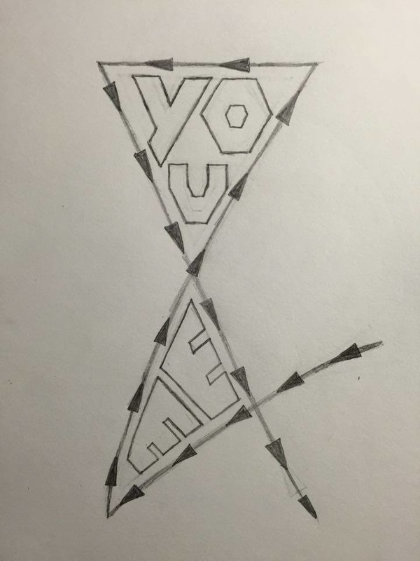 For my Ampersand project I focused on sharp edges and structure. The arrows on the lines of the ampersand represent the path it takes to actually draw an ampersand. I wanted a very simple quote that wasn't completely random, which is what led to "you and me". It was difficult to give the "you" a structured design in the space given of the upper portion of the ampersand, it ended up looking a bit strange but I did the best I could with how I wanted it to look. If I were to do this project again I'd focus more of the design aspect on the ampersand symbol, I think the one I did on this project looks too bland and simple.
 I had a lot of trouble having no guidance one what I should be doing. Being able to do whatever I wanted was a challenge on finding what I actually wanted to create. I decided on the yin and yang sign symbol and put my on twist on it. The yin and yang symbol was something I've been meaning to recreate so I thought why not now? I like the broken up dark side and the clear white side, I personally think it looks pretty cool. I don't have much to say about this piece, it was just a creation that I wanted some fun with and the idea of this project was perfect for it..
|